Saturday, July 8, 2017

141. Joy Division - Unknown Pleasures


Flickr Download DeviantArt


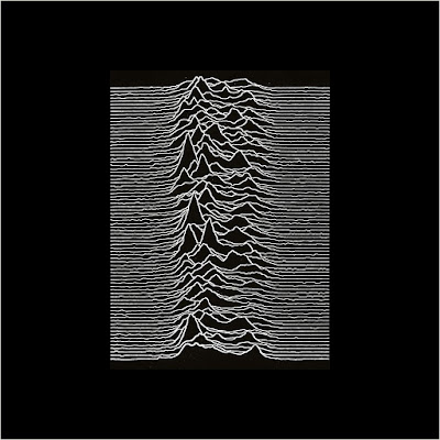
Peter Saville, who had previously designed posters for Manchester's Factory club in 1978, designed the cover of the album. Bernard Sumner chose the image used on the cover, which is based on an image
of radio waves from pulsar CP 1919,  from The Cambridge Encyclopaedia of Astronomy.  Saville reversed the image from black-on-white to  white-on-black and printed it on textured card  for the original
version of the album.  It is not a  Fourier analysis,  but rather an image  of the intensity of  successive radio pulses,  as stated in the Cambridge Encyclopaedia.  The image was  originally created by radio
astronomer Harold Craft at the Arecibo Observatory for his 1970 PhD thesis.

When reviewing the 2007 version of  Unknown Pleasures,  Pitchfork critic Joshua Klein described the cover art as "iconic".  Susie Goldring, reviewing the album for BBC Online said, "The duochrome Peter
Saville cover of this first Joy Division album speaks volumes. Its white on black lines reflect a pulse of power, a surge of bass, and raw angst. If the cover doesn't draw you in, the music will." wikipedia


For my tweak above,  I selected the two waves that best resemble the graphs for the human sexual response cycle of a man light blue) and a
woman (pink). CP 1919 is the first discovered radio pulsar. It was discovered at Cambridge in 1967. The term "pulsar" is taken from the words
"pulse" and "quasar".  Because it was first thought to resemble an extra-terrestrial beacon,  CP 1919 was initially called "little green men" for
the stereotypical portrayal of extraterrestrials as little humanoid-like creatures with green skin and sometimes with antennae on their heads.

The CP 1919 pulsar had a period of 1.3373 seconds and a pulse width of 0.04. This is, of course, too short for thehuman sexual response cycle
(which we commonly couldn't seem to get enough of), but I guess maybe this cycle has some sort of  astronomical resemblance.

For loss of words I may call it coital coincidence.


I wouldn't want to think of little green men. This is the original album cover art design.   


No. 249, The Virgin All-Time Album Top 1000

No. 8, Music Radar, The 50 Greatest Album Covers of All Time


Reviewing the album for Melody Maker,  Jon Savage called Unknown Pleasures an  "opaque manifesto" and declared  "[leaving]  the twentieth
century is difficult;  most people prefer to go back and nostalgise,  Oh boy.  Joy Division at least set a course in the present with contrails for
the future — perhaps you can't ask for much more. Indeed, Unknown Pleasures may very well be one of the best, white, English, debut LPs of
the year." 

Retrospective critical writing on the album has been virtually unanimous in its praise. In 1994, Jon Savage described the music as "a definitive
Northern Gothic statement:  guilt-ridden, romantic, claustrophobic".  Analysing Curtis's work, music journalist Richard Cook remarked in 1983:
"sex has disappeared from these unknown pleasures; it is an aftermath of passion where everything's (perhaps) lost". wikipedia


Album cover art design by Peter Saville, picture of CP 1919 chosen by Bernard Sumner. Album produced by Martin Hannett. Factory, 1979.


(A) Disorder - Day of the Lords - Candidate - Insight - New Dawn Fades

(B) She's Lost Control - Shadowplay - Wilderness - Interzone - I Remember Nothing


"Shadowplay" live from FageOner on YouTube


joydivisionofficial.com


Previous: Jeff Beck - Beck-Ola


Back to Gallery 5


Wednesday, June 28, 2017

140. Jeff Beck - Beck-Ola


 Flickr Download DeviantArt


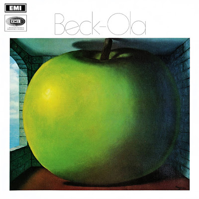
The cover art design for this album is the 1958 painting The Listening Room by the Belgian surrealist artist René Magritte. It features an
overblown green apple  large enough to fit a room from floor to ceiling.  One can also say that the room is small enough for an ordinary
green apple to fit it.  The topic of the size of the  apple or the room is the  subject that raises a question on the mind of the viewer.  In
either case,  the size of the apple  and the room  virtually leave no room for listening and,  again,  the question is  raised as to how the
title fits the painting or how the painting fits the title.

Jeff Beck's  use of the  1958 painting  for his album,  released in 1969,  perhaps finds  the answer.  It shows the apple inside a blue room
with a brick wall  that is opened by an arched window.  This is the later version of the painting.  The other,  from 1952,  originally shows
the apple inside a room with orange walls and a wooden floor.  

In my work above,  there was no such purpose or direction of finding space for 'the listening room.'  The process was purely random. The
finished work did find space outside of the apple  - and inside it.

But as soon as I thought that I had found room,  I realised that listening really doesn't require room or space,  for sound doesn't belong in
the category of space but of time.  One can't listen to this album sanely enough if there was another song or album playing with it at the
same time. One needs time to listen. To the music alone. 


Jeff Beck was right.


René Magritte was a surrealist with a dilemma for the beholder.
The beauty lies in the catharsis from being able to understand.


The original album cover art design is the 1958 version of The Listening Room by René Magritte.
Album produced by Mickie Most. EMI Columbia (UK), Epic (US) 1969. 


(A) All Shook Up - Spanish Boots - Girl from Mill Valley - Jailhouse Rock

(B) Plynth (Water Down the Drain) - The Hangman's Knee - Rice Pudding


"Rice Pudding" live from Lula Zepeliano on YouTube


Back to Gallery 5


Monday, June 12, 2017

139. The Pogues - Rum Sodomy & The Lash


 Flickr Download DeviantArt


The album's title is taken from a quotation attributed to Winston Churchill: "Don't talk to me about naval tradition. It's nothing but rum, sodomy, and the lash."
The title was suggested by drummer Andrew Ranken,  who said "it seemed to sum up life in our band".  The cover artwork is based on  The Raft of the Medusa,
painting by  Théodore Géricault,  with the faces of  the men on the raft  painted by  the artist  replaced by those of the  members of the band  by illustrator
Peter Mennim. wikipedia

On the image above, the original album cover art design is superimposed over the painting The Raft of the Medusa.  The painting can be distinguished from its
different  tone on  the sides; darker at left  and lighter  at right.  One can  tell that the  album  cover  art was  lifted  not from the  centre of  the painting but
somewhat to the right. The combined images was converted to monochrome and the framing was added to make an 18" by 10" poster.


This is the painting The Raft of the Medussa by Théodore Géricault.


This is the original album cover art design.


No. 144, The Virgin All-Time Album Top 1000; No. 440, Rolling Stone, The 500 Greatest Albums of All Time


A third of Jeff Roesgen’s book documents the making of the album, with input from all of the Pogues except Shane [McGowan] and Cait [O'Riordan]. The other
two-thirds,  woven through the narrative,  place the band on board  The Medusa  as she makes her  fateful voyage from  France to Senegal.  It’s a  remarkably
effective technique.  I’d always  thought  of this record  as a product  of the post-punk  politics of 1980s  England and Ireland – but by placing  the band in the
early 19th century with a surrounding cast of soldiers, officers, navvies, as well as profoundly incompetent members of the ruling class, Roesgen highlights the
extraordinary achievement of the Pogues on this album. It’s a glorious celebration of the underdog, of the destitute and the downtrodden. 333sound.com


The Raft of the Medusa, painting by Théodore Géricault; replacements by Peter Mennim.
Album produced by Elvis Costello. Stiff (UK & Europe), MCA (US & Canada), 1985.


(A) The Sick Bed of Cúchulainn - The Old Main DragThe Wild Cats of Kilkenny - I'm a Man You Don't Meet Every DayA Pair of Brown EyesSally MacLennane

(B) Dirty Old Town" - Jesse James - NavigatorBilly's Bones - The Gentleman Soldier - And the Band Played Waltzing Matilda


"Dirty Old Town" live from Moog Bass on YouTube


www.pogues.com

Monday, May 15, 2017

138. Michael Jackson - Thriller


Flickr Download DeviantArt


The King of Pop graces the cover of the best selling album of all time.

This is modest art for an album that sold over 72 million copies worldwide. The cover for Thriller features Michael Jackson in a white suit that belonged to
photographer Dick Zimmerman. 

"The day of the shoot arrive[d]. I hired one of the best fashion stylists in LA to gather a large variety of wardrobe, and we began the arduous
process of selecting attire for the cover and inside spread. After about an hour of weeding through the wardrobe, Michael couldn't find anything
he was crazy about. I started to panic. His eyes lit up when he noticed the white suit that I was wearing. He said, "That's the look I like, do we
have anything like that?" We didn't. Time was fleeting. I was concerned about having enough time to execute my cover ideas. I indicated that
we were about the same height and build and if he would like to wear mine. That was exactly what he wanted. Fortunately for the session and
the time involved, the suit fit like it was tailored for him.

During breaks Michael would stand in front of a full length mirror and practice continual spins. I was privileged to get a personal preview of those
legendary ones that are now so familiar to us all. He just would come alive in front of that mirror. It was fascinating, because he had such a shy
and subdued manner throughout the photo session, but in front of that mirror, dancing, he was electric and that was the first time that I realized
that I was witnessing something very special." The Creation of the Thriller Album Cover by Dick Zimmerman


This is the original album cover art design.

No. 1, Billboard, The 300 Best-Selling Albums of All Time; No. 4, Entertainment Weekly, 100 Greatest Albums Ever;
No. 20, Rolling Stone, The 500 Greatest Albums of All Time; No. 28, Rate Your Music, The 100 Greatest Albums of All Time;
No. 64, The Virgin All-Time Album Top 1000


Photo by Dick Zimmerman, album produced by Quincy Jones & Michael Jackson.
Epic, CBS, 1982.


Blender described Jackson as the "late 20th century's preeminent pop icon", while The New York Times gave the opinion that he was a "musical phenomenon"
and that "in the world of pop music, there is Michael Jackson and there is everybody else". Jackson changed the way the industry functioned: both as an
artistic persona and as a financial, profitable entity. His attorney John Branca observed that Jackson achieved the highest royalty rate in the music industry
to that point: approximately $2 (US$4.61 in 2016 dollars) for each album sold. As a result, Jackson earned record-breaking profits from compact disc sales
and from the sale of copies of the documentary, The Making of Michael Jackson's Thrillerproduced by Jackson and John Landis. Funded by MTV, the film
sold over 350,000 copies in its first few months. In a market then driven by singles, Thriller raised the significance of albums, yet its multiple hit singles
changed perceived notions as to the number of successful singles that could be taken from an individual album. 

At the time of the album's release, a press statement from Gil Friesen, the then President of A&M Records, read that, "The whole industry has stake in this
success". Time magazine speculated that "the fallout from Thriller has given the [music] business its best years since the heady days of 1978, when it had an
estimated total domestic revenue of $4.1 billion". Time summed up Thriller's impact as a "restoration of confidence" for an industry bordering on "the ruins
of punk and the chic regions of synthesizer pop". The publication described Jackson's influence at that point as, "Star of records, radio, rock video. A one-man
rescue team for the music business. A songwriter who sets the beat for a decade. A dancer with the fanciest feet on the street. A singer who cuts across all
boundaries of taste and style and color too".

From the moment Thriller was released, it set the standard for the music industry: artists, record labels, producers, marketers and even choreographers. The
music video was ahead of its time and it is considered a monumental one—not only in Jackson's career, but also in the history of pop music. Epic Records'
approach to creating a song and video that would appeal to the mass market ended up influencing the way that professionals now market and release their
songs. John Landis's production of a mini-movie, rather than the usual short music video, would raise the bar for other directors and producers. wikipedia


(A) Wanna Be Startin' Somethin' - Baby Be Mine - The Girl Is Mine - Thriller

(B) Beat It - Billie Jean - Human Nature - P. Y. T. (Pretty Young Thing) - The Lady in My Life


"Thriller" official video from michaeljacksonVEVO on YouTube


www.michaeljackson.com


Back to Gallery 5


Wednesday, April 19, 2017

137. Elvis Costello & The Attractions - Imperial Bedroom


 Flickr Download DeviantArt


On this work the original  album cover art design has been pared. With it went the artist's name and the album title.
What remained of the original image was pasted at left  and the image was extended  to the right with the addition
of a combination of mirrored images and some misplaced and altered elements.

Thus,  the snake  charmer's  double,  while trying  to stimulate the  "reclining  octopus,"  instead causes  the cobra to
respond to his crooked charms which,  in turn,  alarms him, and gets him ready to flee with an expanded right wing.
And not only that.  The letters "P-A-B-L-O"  on the holes of the  five creatures  that look like zippers handing over his
head now spell "O-L-B-A-P."  Luckily enough,  the snake charmer is able to control the "reclining octopus" by stepping
his platformed  left foot on her  last tentacle  which doesn't  look naughty  at all because  Barney Bubbles  called her
"reclining octopus" instead of something else.


Here's the original work of Barney Bubbles.


No. 166, Rolling Stone, The 500 Greatest Albums of All Time; No. 321, The Virgin All-Time Album Top 1000


Cover art design by Barney Bubbles, album produced by Geoff Emerick
from an  original idea by  Elvis  Costello.  F-Beat (UK),  Columbia (US)
1982.


The name of the album "Imperial Bedroom" appears on the sleeve as
IbMePdErRoIoAmL. The cover painting, titled "Snakecharmer &
Reclining Octopus" by Barney Bubbles (but credited to "Sal Forlenza")
is a pastiche of "Three Musicians" by Pablo Picasso, and letters on
the zipper-like creatures in the upper right spell "PABLO SI". wikipedia


Having gotten country out of his system with Almost Blue, Elvis Costello returned to pop music with Imperial Bedroom -
and it was  pop in the classic,  Tin Pan  Alley sense.  Costello  chose to hire  Geoff Emerick,  who engineered  all of the
Beatles' most ambitious records, to produce Imperial Bedroom,  which indicates what it sounds like - it's traditional pop
with a post-Sgt. Pepper production.

Essentially,  the songs on Imperial Bedroom are an extension of Costello's jazz and  pop infatuations on Trust.  Costello's
music is  complex  and intricate,  yet it flows  so smoothly, it's easy  to miss  the bitter, brutal lyrics.  The  interweaving
layers of  "Beyond  Belief"  and the whirlwind  intro  are the most overtly  dark sounds  on the record,  with most  of the
album given over to the orchestrated, melancholy torch songs and pop singles.  Never once do Costello & the Attractions
deliver a  rock & roll song  - the album is all  about  sonic detail,  from the accordion on  "The Long Honeymoon"  to the
lilting strings on "Town Cryer."

Of course,  the detail  and the ornate  arrangements  immediately peg  Imperial  Bedroom  as Costello's most  ambitious
album, but that doesn't mean it's his absolute masterpiece. Imperial Bedroom remains one of Costello's essential records
because it is the culmination of his ambitions and desires -  it's where he proves that he can play with the big boys, both
as a songwriter and a record-maker.  It may not have been a commercial blockbuster, but it certainly earned the respect
of legions of musicians and critics who would have previously disdained such a punk rocker.
AllMusic Review by Stephen Thomas Erlewine


(A) Beyond Belief - Tears Before Bedtime - Shabby Doll - The Long Honeymoon - Man Out of Time - Almost Blue - . . . And in Every Home

(B) The Loved Ones - Human Hands - Kid About It - Little Savage - Boy with a Problem - Pidgin English - You Little Fool - Town Cryer


"You Little Fool" music video from ElvisCostelloVEVO on YouTube.


www.elviscostello.com


Previous: Yes - Relayer

Next: Michael Jackson - Thriller


Back to Gallery 5


Monday, April 3, 2017

136. Yes - Relayer


Flickr Download DeviantArt


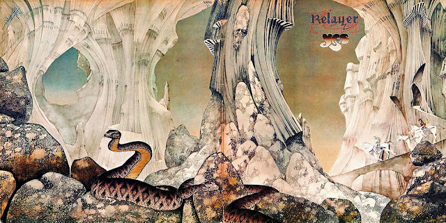
The album's sleeve was designed and illustrated by English artist Roger Dean, who had designed artwork for the band since 1971. Speaking about the cover in 2004, Dean said:
"I was playing with the  ideas of the ultimate castle,  the ultimate wall of a fortified city.  That was more of a  fantastical idea.  I was looking for the kinds of things like the
Knights Templar would have made or what you'd see in the current movie Lord of the Rings.  The curving,  swirling cantilevers right into space."  The images depicted in many
of Dean's album covers set an  otherworldly tone and are an  identifiable part of the  band's visual style.  For Relayer,  the warriors on horseback  reflect the  lyrical themes of
war present in "The Gates of Delirium". wikipedia


My tweak of the original album cover art design is simply the whole of the  front side of the gatefold that was
extended on the sides  by mirroring part of the original image  (left)  and by repeatedly  adding a portion of it
(right).  The album  title was  covered  and the  band's name  was used  to form a  cloud of smoke  from some
faraway fire, a sight which I think,  is not totally incompatible with a parade of horse-riding warriors treading
across an eerie and craggy landscape.

The mirroring  at left produced  what might look  like a starfish  misplaced in the arid terrain,  or some slimy
creature  encircling  a pointed crystal dome  in which sits an icon of  some alien idol,  but on the gatefold this
part of the image is actually the tail of a snake encircling a rock.


Cover art design and illustration by Roger Dean, album produced by Eddy Offord. Atlantic 1974. 


Rarely have a band and an artist been so closely associated through the years as Yes and Roger Dean. As of 1991, the prolific artist has drawn or painted eleven of the group's
album covers, from Fragile to Union. He's also designed covers for such Yes offshoots as Asia, Steve Howe's solo projects and Anderson, Bruford, Wakeman and Howe.

Dean thinks he knows why Relayer is singled out among his efforts for Yes:  "If I had to describe my skills," he says, "they started out with me being a designer and draftsman,
and Relayer  is the peak of those two skills.  "It took him about 300 hours  to render the artwork,  which was actually quite small  -  only an inch larger  than the wraparound
jacket  for the LP.

Curiously,  Dean had not heard  Relayer when he began work on the cover.  In fact,  Yes's Jon Anderson  came up with the title after seeing Dean's drawing.  "I never paint the
music," says Dean.  "I'm very skeptical of people who say they do.  It's very rare for the  members of Yes to sit down and say,  'This is the flavor of the music.  Do you think you
can get a bit more into the picture?' It doesn't work that way." www.superseventies.com


(A) The Gates of Delirium

(B) Sound Chaser - To Be Over


Sunday, March 26, 2017

135. Beastie Boys - Hello Nasty


Flickr Download DeviantArt


The title for the  album was allegedly  inspired by the receptionist of their NY based publicity firm  Nasty Little Man
who would answer the phone with the greeting "Hello Nasty".

The art cover depicts all three members (Horovitz, Yauch and Diamond from left to right) wrapped in an aluminium
sardine tin and getting baked in the sun. The band makes a reference to this in the song "Body Movin'," in which the
lyrics goes, "MCA, where have you been? Packed like sardines in a tin." wikipedia


Here's the original album cover art design.

No. 732, The Virgin All-Time Album Top 1000


Cover design by Bill McMullen, art direction by Cey Adams,
photography by Michael Lavine, album produced by Beastie Boys and
Mario Caldato, Jr. Capitol 1998.


Hello Nasty received mostly positive reviews upon release.  Caroline Sullivan,  writing for The Guardian,  named the
album the "Pop CD of the Week"  and stated that it  "fills a gap created by the current profusion of serious rock bands
like Radiohead;  elbowing its way up front, [and letting] rip with adolescent vigour."  She went on to summarize the
record as "the perfect party soundtrack by the perfect party band."

Although AllMusic's  Stephen Thomas Erlewine  felt that the album's ending was  "a little anticlimactic",  he also saw
Hello Nasty  as a progressive  step forward from the group's  1992 LP  Check Your Head,  and praised the input of the
group's  new  recruit,  Mixmaster  Mike;  "Hiring DJ  Mixmaster  Mike  turned  out  to be a  masterstroke;  he and the
Beasties created a sound that strongly recalls the spare electronic funk of the early '80s, but spiked with the samples
and post-modern absurdist wit that have become their trademarks." wikipedia

www.billmcmullen.com


(A) Super Disco Breakin' - The Move - Remote Control - Song For the Man - Just a Test - Body Movin'

(B) Intergalactic - Sneakin' Out the Hospital - Putting Shame in Your Game - Flowin' Prose - And Me - Three MC's and One DJ

(C) The Grasshopper Unit (Keep Movin') - Song For Junior - I Don't Know - The Negotiation Limerick File - Electrify

(D) Picture This - Unite - Dedication - Dr. Lee, PhD - Instant Death


"Intergalactic" live from BeastieBoysVEVO on YouTube.